Hello, my name is Amei-Lee. I'm a student at Cegep Montmorency. I'm not on a study program at the moment, but I would like to move toward Graphic Design. For those who don't know what the job is, here is a small definition: the Graphic Designer produces visual material. Its mission is to effectively communicate various messages, online or offline, through a variety of mediums. It can be printed material (leaflets, packaging, billboards, posters, etc.) or virtual tools such as websites. So, that's why I made this glossary for people who want to learn more about this profession and who are interested. These are often words that we do not understand and who are often use in this job. That's why I show them to you. I put you the definitions, the pronunciation and an image for each word. I hope you will enjoy and learn more on this subject.
alignment
noun
The alignment corresponds to the position of the text or graphic elements (left, right, center or justified).
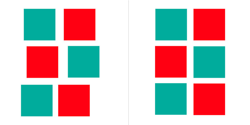
asymmetrical
noun
When the graphic elements and the text are not distributed equally around a central axis, the design is said to be asymmetrical.
contrast
noun
Contrast occurs when two elements on a page are different. For example, it could be different colors between the text and the background color or dark vs. light colors.
hierarchy
noun
The visual arrangement of design elements in a way that signifies importance. For example, you might make a title big and bold to ensure it attracts more attention than a small, lightly colored image caption.
icon
noun
Icons are something we all see practically every day—they’re images used to represent objects or actions. One of the most common examples of an icon is a magnifying glass used to signify a search, which is used on Google and countless other websites.
layer
noun
A set of layers stacked on top of each other, each of which contains part of the paint or drawing elements that make up the whole and is transparent elsewhere.
lorem ipsum
noun
Also known as ‘dummy copy’, lorem ipsum is a generic filler text used when the real text is not available. It’s used as placeholder text to demonstrate how a design will look once the real body copy has been included.
margin
noun
The margin is the blank space between the edge of a page and the content within it. The margin ensures that everything, but especially text and body copy, sits properly and comfortably in the document. The width of a margin can really affect the overall feel and look of a design.
monochrome
adjective
Monochrome is a colour palette made up of various different shades and tones of a single colour. It’s important to note that while grayscale is monochrome, monochrome is not necessarily greyscale—monochrome images can be made up of any colour, for example an image made up of different shades and tones of purple.
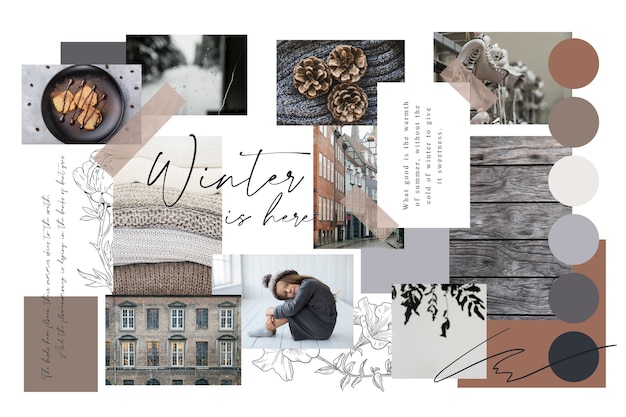
moodboard
noun
The starting point for a lot of designers, a moodboard is a way for designers to collect together lots of visual references for a new design project—these can be photos, images or typography. Moodboards are used to develop the project’s aesthetic, for inspiration or to help communicate a specific idea or concept.
pixel
noun
A contraction of the words ‘picture’ and ‘element’, a pixel are the smallest basic unit of programmable colour on a computer and all digital images are made up of a large number of individual pixels. Basically, they’re very, very small but very, very important.
resolution
noun
The term resolution refers to the number of units, measured in either DPI or PPI, that occupy a linear inch an image, both on screen and in print. Resolution is used to denote the quality of an image—it can generally be assumed that the higher the resolution, the better the quality of the image. You can tell if the resolution is too low as the image will appear blurry or pixelated.
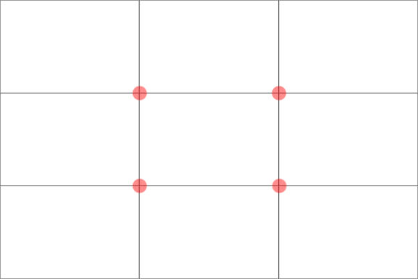
rule of thirds
noun
The rule of thirds is a helpful way of aligning the subject of an image and making it aesthetically pleasing as possible. Imagine a 3×3 grid (or even add one in Photoshop or InDesign) over your picture and align the picture’s subject with the guidelines or intersection points (where the lines meet) or allow the picture’s different elements to flow through the grid.
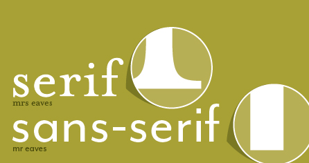
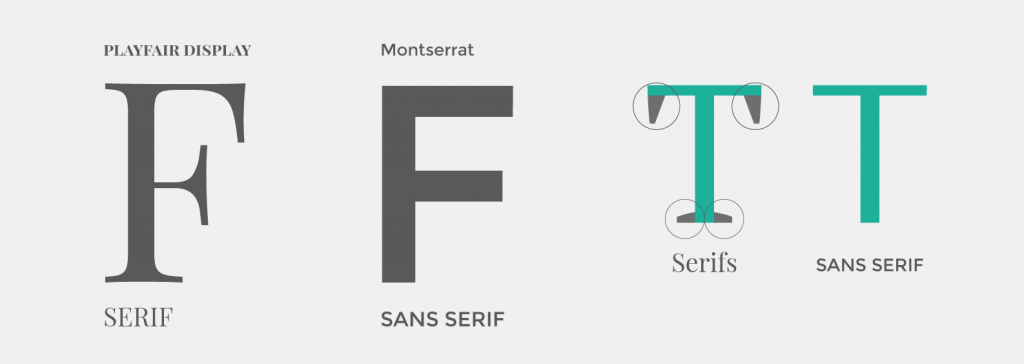
sans serif
noun
Sans is French for ‘without’ so you can probably guess that San Serif Fonts are fonts without serifs on the end of their letters. Usually, sans serif fonts are easier to read on the web and digital screens—for instance, Apple use the sans serif font Helvetica Neue, across all their operating systems. Alongside Helvetica Neue, some of the most well known examples of sans serif fonts are Futura and Brandon Grotesque.
serif
noun
A serif is the small line that appears on the end of a letter in some typefaces—these typefaces are known as Serif Fonts. Serif fonts are easier to read in printed designs as the serifs make letters more distinctive and their shape makes even letter easier to recognise. Famous examples of serif fonts include Baskerville, Times New Roman and Garamond.
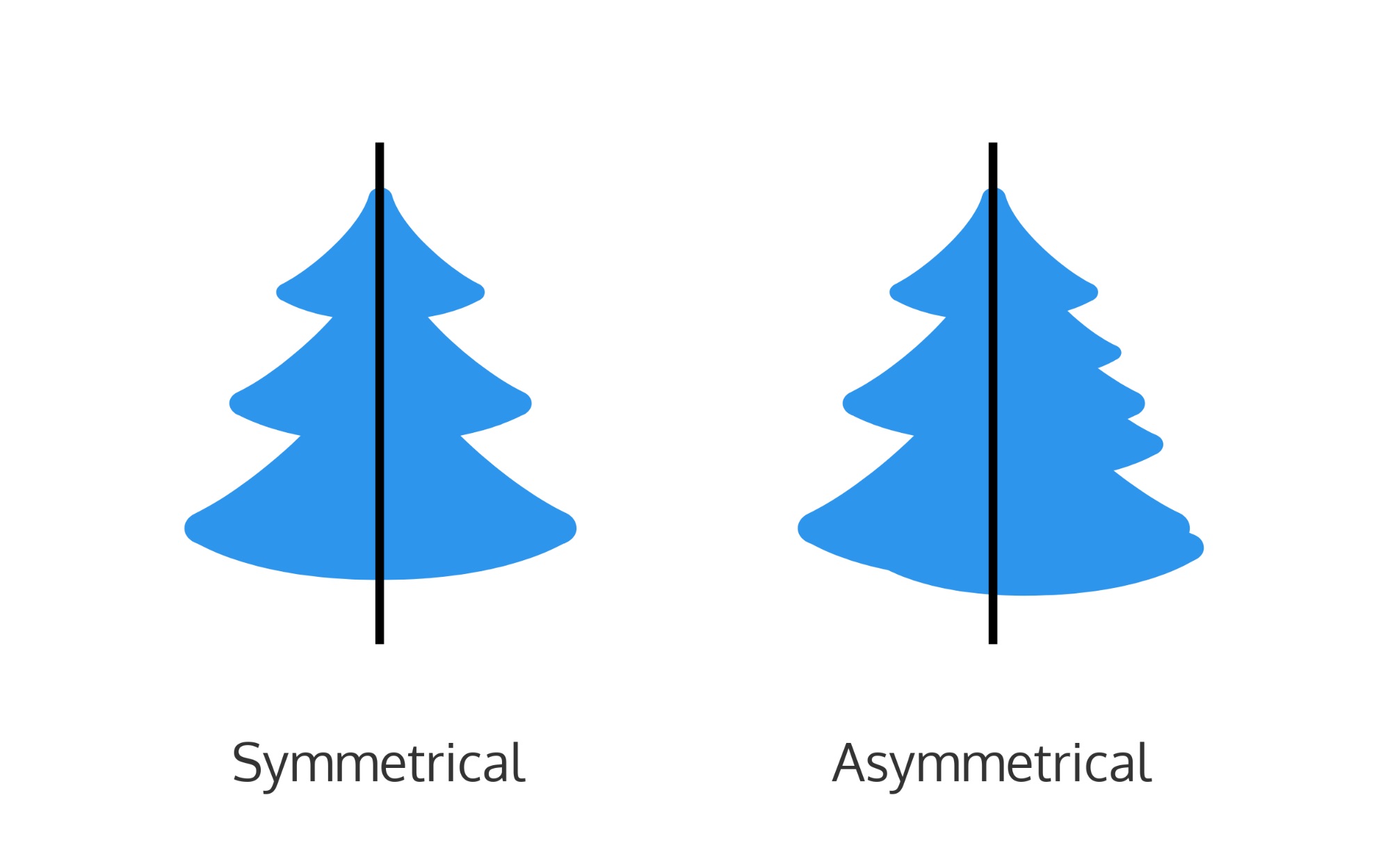
symmetry
noun
In everyday terms, symmetry refers to a sense of harmonious balance and proportion. It’s something most people are introduced to at an early age. In design terms, one of the fundamental principles of design, it does much the same—symmetry is used to add balance and create a sense of harmony in a design.
texture
noun
In design, texture refers to the visual appearance of a design. In others, adding rich, layered graphics to a design can help to create a visual texture. Designs can also imitate textures such as metal or fabric to likewise create a visual texture or add a fabricated tactile feel. Finally, texture can also be added to a print design through printing on different paper stocks or materials.
typography
noun
The term typography refers to two things. Firstly, the style and appearance of printed words. Secondly and more importantly, it refers to the art and procedure of arranging type to make it readable, legible, attractive and engaging in print or digital designs. Typography is something that all graphic designers will deal with in their careers—whether they are working at a type foundry, creating their own typefaces, or working in UX design.
vector
noun
A vector is a graphic image that is made with mathematical equations—they’re defined in terms of 2D points connected by lines and curves to form shapes. Basically this means that vectors can be resized or scaled to any size without losing quality or getting blurry.
wireframe
noun
The wireframe or functional model is a diagram used when designing a user interface to define the areas and components that it must contain.